“Subway Particle Levels Aren’t That High” by jefftk
- Author
- LessWrong ([email protected])
- Published
- Wed 09 Jul 2025
- Episode Link
- https://www.lesswrong.com/posts/rj75cGJhPCHnPMDvF/subway-particle-levels-aren-t-that-high
I recently read an
article
where a blogger described their decision to start masking on the
subway:
I found that the subway and stations had the worst air quality of my
whole day by far, over 1k ug/m3, ... I've now been masking for a
week, and am planning to keep it up.
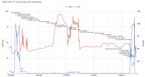
While subway air quality isn't great, it's also nowhere near as bad as
reported: they are misreading their own graph. Here's where the
claim of "1k ug/m3" (also, units of "1k ug"? Why not "1B pg"!) is
coming from:
They've used the right axis, for CO2 levels, to interpret the
left-axis-denominated pm2.5 line. I could potentially excuse the
error (dual axis plots are often misread, better to avoid) except it
was their own decision to use a dual axis plot in the first place!
Hat tip to [...]
---
First published:
July 9th, 2025
Source:
https://www.lesswrong.com/posts/rj75cGJhPCHnPMDvF/subway-particle-levels-aren-t-that-high
---
Narrated by TYPE III AUDIO.
---
Images from the article:
Apple Podcasts and Spotify do not show images in the episode description. Try Pocket Casts, or another podcast app.